End Game
The world has ended, but your fight has just begun. In this shattered landscape, you must scavenge for supplies, outwit desperate survivors, and face off against unspeakable threats lurking in the ruins. Every decision could be your last—will you form fragile alliances or go it alone? In the End Game, only the strongest, smartest, and most ruthless will make it out alive. Can you survive when civilization crumbles? The clock is ticking.
Front Cover
The design of End Game is striking and thematic, capturing the post-apocalyptic setting effectively. The dominant mushroom cloud explosion symbolizes the catastrophic event that sets the tone of the game. The dark, smoky sky and fiery reflection on the water create a sense of destruction and despair. The game's title, "End Game," is rendered in a distressed, stencil-like font, evoking the rugged, makeshift aesthetic of a world in ruin.
The tagline, "Survive the End Times," reinforces the game's survivalist theme, while the "13+" age rating suggests mature themes and intense gameplay. The overall color palette of dark reds, browns, and yellows further emphasizes the devastation and urgency of the scenario. This design choice complements the narrative of scavenging, forming alliances, and confronting threats in a fight for survival.
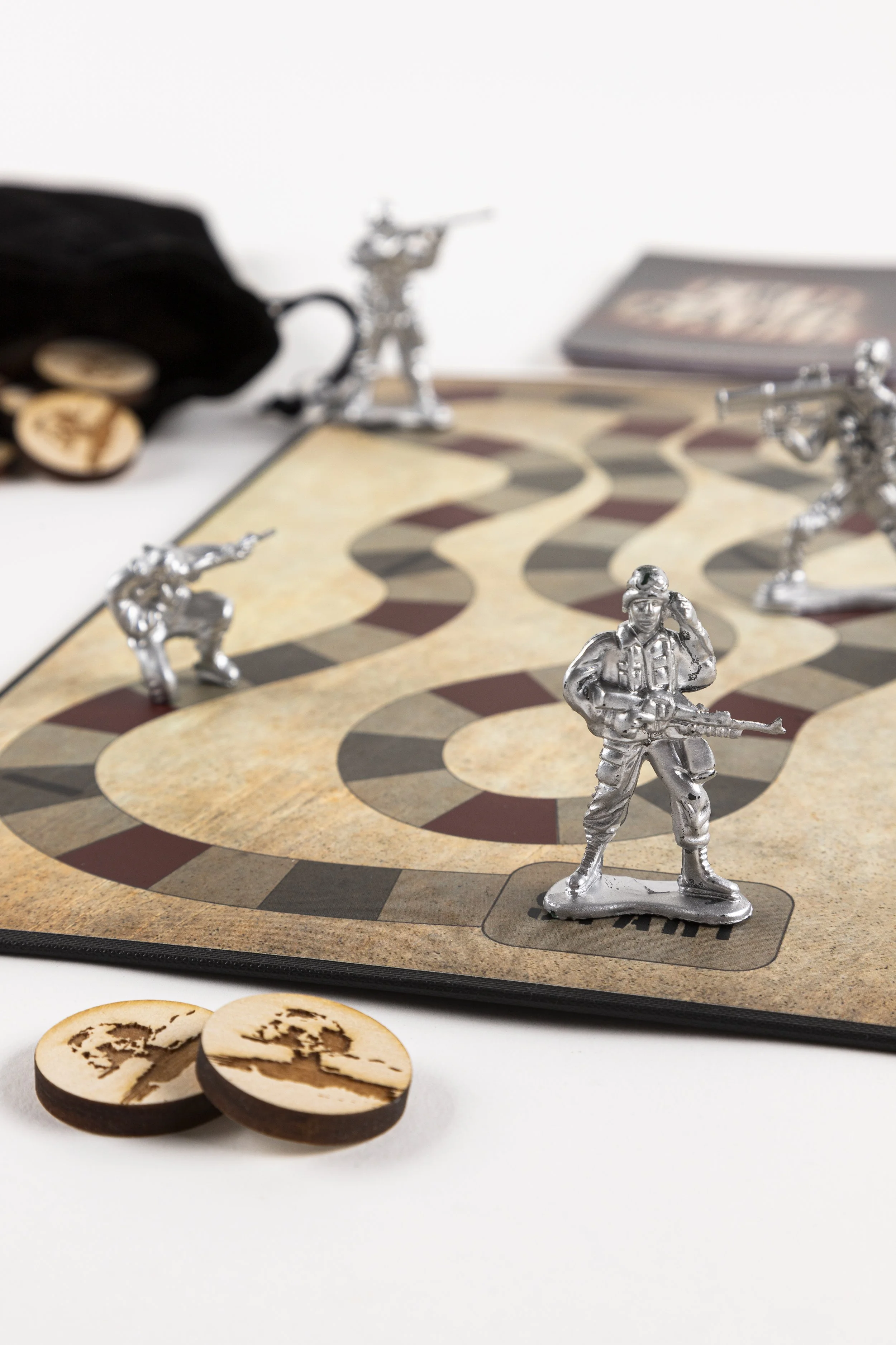
Game Board
The game board is designed with a parchment paper texture that imparts a sense of wear and age, adding to the overall atmosphere of the game. This textured look enhances the theme and immerses players in the experience. The color palette consists of deep red, muted grey, and stark black, thoughtfully highlighting each game space and creating a visually striking contrast.
The layout of the board is symmetrical, lending a sense of balance that contrasts with the chaotic theme of a nuclear wasteland. This design approach is intentional, as it aims to evoke the feeling of exploring an expansive, desolate landscape where players can imagine themselves navigating the remnants of a world altered by disaster. Every detail contributes to an intriguing and immersive gameplay experience.
Survival Log
The survival log is given to each player and serves as a location check-off marker. It helps players remember which scenarios have occurred and which have not, as these can change the outcome of the game. Its importance is reflected in its simple design, which uses a grid-like system and clear text for easy navigation. Additionally, the log is printed on parchment paper and features dark red, distressed typography to enhance the game's mood.
Game Cards
The game cards were carefully designed to capture the overall aesthetic of the game, featuring a striking knocked-out image of a location to fully immerse the player. The typography, while stylistic, is crucial for conveying important information and is prominently displayed on the side of the card for easy reading.
Additionally, the back of each card mirrors the front cover of the game, ensuring a cohesive look across all components. This attention to detail creates a visually appealing and functional set of cards, enriching the players' experience and drawing them deeper into the game’s world.